Topic modelling on one of Germany's most popular Corona podcast
By Lukas Steger
Since the early start of the Corona pandemic German public broadcaster NDR Info airs the popular podcast with the virologist Christian Drosten.
In addtion to the podcast itself the transcript of each episode is published on the broadcaster’s website. This allows to easily do some text processing and analysis on the podcasts’ content.
First I wrote a script to scrape and transform the transcript of all podcast episodes to get a dataframe with the columns episode title, date, link to the transcript, episode no, interviewer, speaker of the transcript section and transcript section. On my Github you can find the raw dataframe and the R script to scrape the transcripts.
library(tidyverse)
episodes_df <- read_rds(path = url("https://github.com/quickcoffee/drosten_topicmodelling/raw/master/episodes_df.rds"))
interviews_df <- read_rds(path = url("https://github.com/quickcoffee/drosten_topicmodelling/raw/master/interviews_raw.rds"))

library(gt)
interviews_df %>%
  head(4) %>%
  gt() %>%
tab_options(table.font.size = 8)| title | date | link | episode_no | interviewer | speaker | transcript |
|---|---|---|---|---|---|---|
| Das Virus kommt wieder | 2020-06-23 14:24:00 | https://www.ndr.de/nachrichten/info/coronaskript214.pdf | 50 | Korinna Hennig | Korinna Hennig | Nun sind doch wieder Schulen und Kindergärten geschlossen. Das Wort „Lockdown“ hat nach dem Ausbruch in einem Fleischbetrieb in Rheda-Wiedenbrück in Nordrhein-Westfalen wieder seinen Weg in die Nachrichten gefunden, zumindest im regionalen Zusammenhang. Quo vadis, Nordrhein-Westfalen? Quo vadis, Deutschland? Bleibt das ein örtlich begrenztes Infektionsgeschehen? Und trotzdem, wir stehen immer noch gut da im internationalen Vergleich. In Brasilien und den USA ist das Virus weit davon entfernt, Ruhe zu geben, Israel steht möglicherweise vor einer zweiten Welle. Was können wir hier in Deutschland von all dem lernen? Mein Name ist Korinna Hennig, willkommen zur tatsächlich schon 50. Folge unseres Podcasts, heute ist Dienstag, der 23. Juni 2020. Wir wollen also auf die aktuelle Lage blicken, und damit verbunden auch noch einmal auf die Bildung von sogenannten Clustern, also viele Ansteckungen innerhalb einer Gruppe, an einem Ort, in etwa zur gleichen Zeit. Und wir wollen fragen: Wo stehen wir genau eigentlich in der Pandemie? Was können wir den Sommer über als Leitplanken für unser Handeln im Alltag mitnehmen? Zu all dem bin ich, per App verbunden mit Professor Christian Drosten in Berlin. Guten Tag, Herr Drosten! |
| Das Virus kommt wieder | 2020-06-23 14:24:00 | https://www.ndr.de/nachrichten/info/coronaskript214.pdf | 50 | Korinna Hennig | Christian Drosten | Hallo. |
| Das Virus kommt wieder | 2020-06-23 14:24:00 | https://www.ndr.de/nachrichten/info/coronaskript214.pdf | 50 | Korinna Hennig | Korinna Hennig | Wir haben jetzt im echten Leben eine Situation, die wir auf dem Papier in den vergangenen Podcast-Folgen schon diskutiert haben: Die Reproduktionszahl ist wieder gestiegen. Je nachdem, welche Schätzung und zeitliche Bereinigung man nimmt, liegt sie laut RobertKoch-Institut um zwei herum. Das liegt aber nicht an einer flächendeckenden Ausbreitung des Virus, sondern an Ausbrüchen in einzelnen Gebieten. Wenn wir nach Nordrhein-Westfalen gucken, auf die vielen Ansteckungen in einem großen Fleischbetrieb: Für wie beherrschbar halten Sie die Ausbreitung dort noch? |
| Das Virus kommt wieder | 2020-06-23 14:24:00 | https://www.ndr.de/nachrichten/info/coronaskript214.pdf | 50 | Korinna Hennig | Christian Drosten | Ich denke, dass man in diesem Ausbruch spezielle Maßnahmen braucht. Es gibt ja, wenn man sich das anschaut, ein paar Indikatoren, die darauf schließen lassen, dass das Virus schon in die Bevölkerung hinausgetragen wurde. Da ist es schon erwartbar, dass es zu einer Verzögerung beim Bemerken dieser Erkrankung kommt: Personen müssen ja erst mal Symptome kriegen, diese Symptome erst einmal ernst nehmen, dann zum Arzt gehen, dann muss getestet werden, dann muss das gemeldet werden. Dann weiß man irgendwann, es gibt doch schon Fälle in der Bevölkerung in einem Maß, das vielleicht besorgniserregend ist. |
For the text analysis I will use the {tidytext} package. As a first step I create a stopword list with {SnowballC} and some common words that I identified as having little information.
Each transcript section get a unique ID variable to make it later easier to match new data to the initial data.
A term frequency–inverse document frequency matrix is then created, based on the word frequencies within the transcript sections.
Based on the blog post by Julia Silge I trained multiple topic models with varying number of topics K.
library(stm)
library(furrr)
no_cores <- availableCores() - 1
plan(multicore, workers = no_cores)

many_models <- tibble(K = seq(6, 20, by=1)) %>%
  mutate(topic_model = future_map(K, ~stm(interviews_sparse, K = .,
                                          verbose = F)))

heldout <- make.heldout(interviews_sparse)

k_result <- many_models %>%
  mutate(exclusivity = map(topic_model, exclusivity),
         semantic_coherence = map(topic_model, semanticCoherence, interviews_sparse),
         eval_heldout = map(topic_model, eval.heldout, heldout$missing),
         residual = map(topic_model, checkResiduals, interviews_sparse),
         bound =  map_dbl(topic_model, function(x) max(x$convergence$bound)),
         lfact = map_dbl(topic_model, function(x) lfactorial(x$settings$dim$K)),
         lbound = bound + lfact,
         iterations = map_dbl(topic_model, function(x) length(x$convergence$bound)))

k_result %>%
  transmute(K,
            `Lower bound` = lbound,
            Residuals = map_dbl(residual, "dispersion"),
            `Semantic coherence` = map_dbl(semantic_coherence, mean),
            `Held-out likelihood` = map_dbl(eval_heldout, "expected.heldout")) %>%
  gather(Metric, Value, -K) %>%
  ggplot(aes(K, Value, color = Metric)) +
  geom_line(size = 1.5, alpha = 0.7, show.legend = FALSE) +
  facet_wrap(~Metric, scales = "free_y") +
  labs(x = "K (number of topics)",
       y = NULL,
       title = "Model diagnostics by number of topics",
       subtitle = "Between 10 to 15 seems like a reasonable number of topics")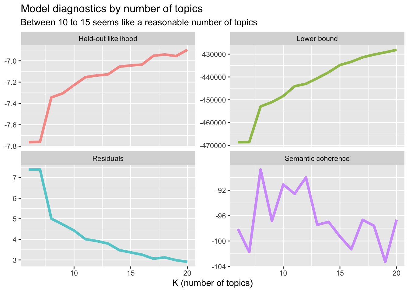
k_result %>%
  select(K, exclusivity, semantic_coherence) %>%
  filter(K %in% c(10, 13, 14)) %>%
  unnest() %>%
  mutate(K = as.factor(K)) %>%
  ggplot(aes(semantic_coherence, exclusivity, color = K)) +
  geom_point(size = 2, alpha = 0.7) +
  labs(x = "Semantic coherence",
       y = "Exclusivity",
       title = "Comparing exclusivity and semantic coherence",
       subtitle = "Models with fewer topics have higher semantic coherence for more topics, but lower exclusivity")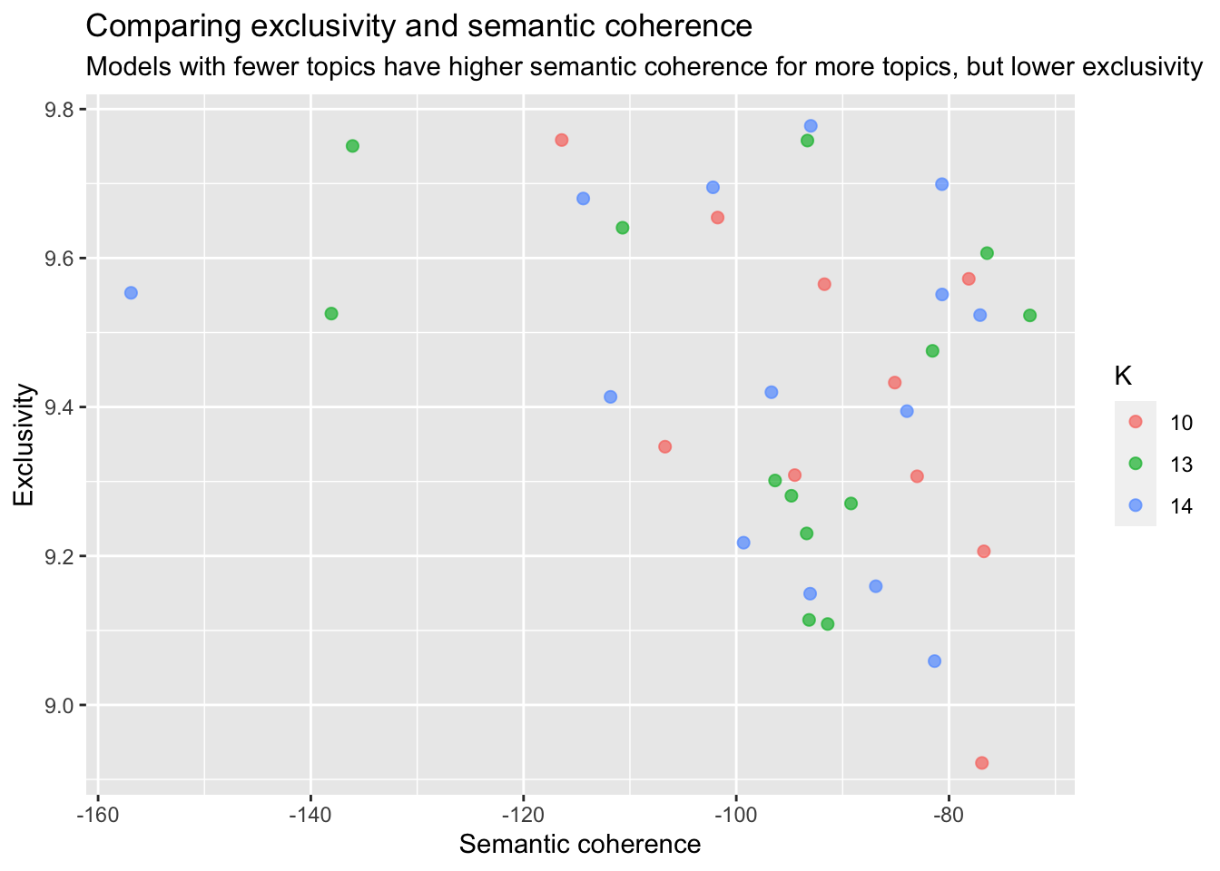
I figured a good number of topics would be around 15 and after looking at the contributing words for each topic I decided to go with 14 topics.
#select K = 14 topics
topic_model <- k_result %>%
  filter(K == 14) %>%
  pull(topic_model) %>%
  .[[1]]

td_beta <- tidy(topic_model)

td_gamma <- tidy(topic_model, matrix = "gamma",
                 document_names = rownames(interviews_sparse))

library(ggthemes)

top_terms <- td_beta %>%
  arrange(beta) %>%
  group_by(topic) %>%
  top_n(7, beta) %>%
  arrange(-beta) %>%
  select(topic, term) %>%
  summarise(terms = list(term)) %>%
  mutate(terms = map(terms, paste, collapse = ", ")) %>%
  unnest()

gamma_terms <- td_gamma %>%
  group_by(topic) %>%
  summarise(gamma = mean(gamma)) %>%
  arrange(desc(gamma)) %>%
  left_join(top_terms, by = "topic") %>%
  mutate(topic = paste0("Topic ", topic),
         topic = reorder(topic, gamma))

gamma_terms %>%
  ggplot(aes(topic, gamma, label = terms, fill = topic)) +
  geom_col(show.legend = FALSE) +
  geom_text(hjust = 0, nudge_y = 0.0005, size = 3,
            family = "IBMPlexSans") +
  coord_flip() +
  scale_y_continuous(expand = c(0,0),
                     limits = c(0, 0.27),
                     labels = scales::percent_format()) +
  theme(plot.title = element_text(size = 16,
                                  family="IBMPlexSans-Bold"),
        plot.subtitle = element_text(size = 13)) +
  labs(x = NULL, y = expression(gamma),
       title = "Topics by prevalence in the NDR Info\nCoronavirus-Update corpus",
       subtitle = "With the top words that contribute to each topic")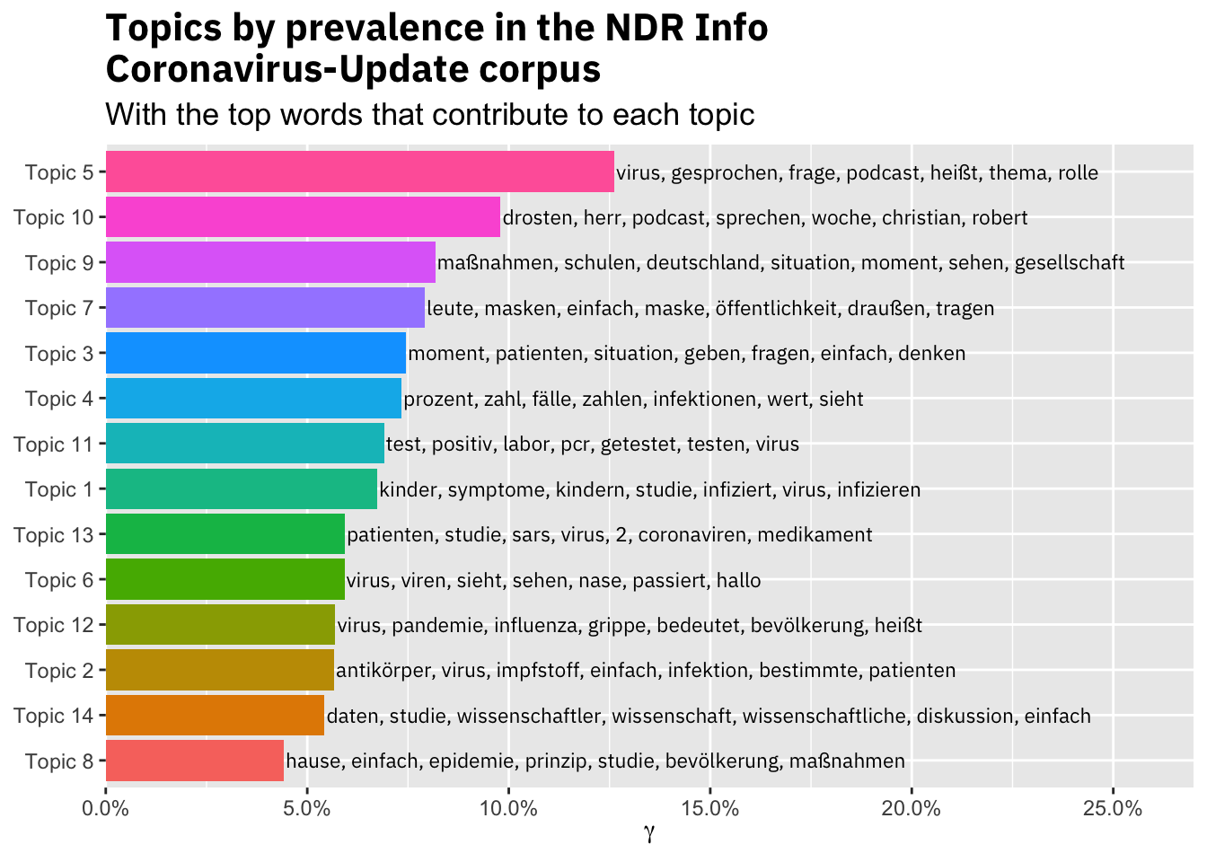
The resulting topics are not super specific, but seem to capture the main themes in the podcast. Topic 2 for example is about antibodies and vaccine, while Topic 7 captures the discussion about wearing masks in public.
With the topics in place I was interested how the share of the topics changes over the course of the pandemic.
#weight gamma of each transcript section by the lenght of the episode
episodes_topic_tbl <- td_gamma %>%
  left_join(interviews_df, by = c("document" = "id")) %>%
  mutate(transcript_length = nchar(transcript)) %>%
  group_by(episode_no, topic) %>%
  mutate(gamma_weighted = gamma * (transcript_length/sum(transcript_length)))
episodes_topic_tbl <- episodes_topic_tbl %>%
  left_join(episodes_topic_tbl %>%
              top_n(n = 1, wt = gamma) %>%
              select(episode_no, topic, top_gamma_transcript = transcript))

#helper fun from https://stackoverflow.com/questions/52919899/ggplot2-display-every-nth-value-on-discrete-axis for plotting only every other value:
every_nth = function(n) {
  return(function(x) {x[c(TRUE, rep(FALSE, n - 1))]})
}

p_topics <- episodes_topic_tbl %>%
  summarise(gamma_sum = sum(gamma_weighted), top_gamma_transcript = max(top_gamma_transcript)) %>%
  left_join(top_terms, by = "topic") %>%
  left_join(episodes_df, by = c("episode_no")) %>%
  ggplot(aes(x=as_factor(as.numeric(episode_no)), y=gamma_sum, fill = as_factor(topic), group = topic,
             text = paste("Episode No: ", as_factor(as.numeric(episode_no)),
                          "<br>Date: ", as.Date(date),
                          "<br>Gamma: ", round(gamma_sum, 3),
                          "<br>Topic: ", as_factor(topic),
                          "<br>Terms: ", terms
             )))+
  geom_area()+
  facet_wrap(~as.factor(topic))+
  theme(legend.position='none')+
  scale_x_discrete(breaks = every_nth(n = 5))+
  labs(x="Episode No",
       y="Gamma")

#make interactive plot
library(plotly)
ggplotly(p_topics, tooltip = "text")
There are only a few episodes that are dominated by one topic. Topic 12 most likely is about comparing COVID-19 to the regular flu and was more of a topic until mid March, while recent discussions and media coverage regarding studies on the infectivity of children likely caused a much higher share of Topic 1 in episodes 36 to 38.
Topic 7 regarding masks in public spaces increased its share gradual until the beginning of April, when most of Germany made it compulsory to wear masks in shops, restaurants and public transport.
Out of curiosity I also looked at the share of speech by each speaker. Interestingly, the podcast episodes increased in length over time, but it should be noted that NDR Info reduced the number of episodes from five per week to one per week.
library(scales)
episodes_topic_tbl %>%
  ungroup() %>%
  group_by(episode_no, speaker) %>%
  summarise(length = sum(transcript_length)) %>%
  ggplot(aes(x=as_factor(as.numeric(episode_no)), y=length, fill = fct_relevel(speaker, "Korinna Hennig",
                                                                              "Anja Martini",
                                                                              "Christian Drosten",
                                                                              "Dirk Brockmann")))+
  geom_col()+
  scale_y_continuous(label=comma)+
  theme(legend.position="top",
        axis.text.x = element_text(angle = 90, vjust = 0.5, hjust=1))+
  labs(fill = "Speaker",
       x = "Episode No",
       y = "Length (Characters)")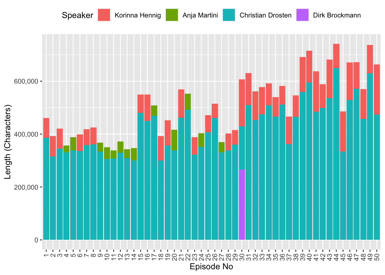
I hope you enjoyed this post and feel free to make your own analysis on the transcripts!
/Lukas