TidyTuesday Week 15: Internationalisation of the Tour de France
By Lukas Steger
I thought the Beer Production data would be my favorite dataset for TidyTuesday, but this week’s Tour de France data from the excellent {tdf} package by Alastair Rushworth is going straigth to the top spot!
The data mainly comes from Wikipedia and has all sort of data on TdF winners and stages.
Being quite familiar with the Tour de France and its stats I’m less interested in stage lengths and winning margins, but I would like to analyse the development of internalisation of the Tour de France and cycling as a sport. I recommend the book “The Economics of Professional Road Cycling” by Van Reeth and Larson if you are into the economics of sports in general and get a deep-dive into cycling.
First I’m going to load the data:
library(tidyverse)
library(lubridate)
library(ggtext)

#load
tuesdata <- tidytuesdayR::tt_load(2020, week = 15)

#load tdf winnders data
tdf_winners <- tuesdata$tdf_winners
tdf_stages <- tuesdata$tdf_stages
The first plot shows the cumulative count of the unique nationalities of the overall classification winners:
#define some nice colors
c_black <- c("#303030")
c_yellow <- c("#F7DA00")

#plot cumulative count of overall winners nationalities
cum_nat_tdf <- tdf_winners %>%
  mutate(start_year = year(start_date),
         cum_unique_nationalities = cumsum(!duplicated(nationality))) %>%
  ggplot(aes(x=start_year, y = cum_unique_nationalities))+
  geom_bar(stat = "identity", fill = c_yellow, width = 1)+
  annotate( geom = "curve", x = 1982, y = 10, xend = 1986, yend = 8.2,
    curvature = -0.2, arrow = arrow(length = unit(1, "mm")), color = c_yellow)+
  annotate(geom = "text", x = 1982, y = 10, label = "First non-European Winner:\nGreg LeMond, 1986",
           hjust = "right", size = 3, color = c_yellow)+
  annotate( geom = "curve", x = 2000, y = 13, xend = 2011, yend = 12.2,
    curvature = -0.7, arrow = arrow(length = unit(1, "mm")), color = c_yellow)+
  annotate(geom = "text", x = 2000, y = 13, label = "First Australian Winner:\nCadel Evans, 2011",
           hjust = "right", size = 3, color = c_yellow)+
  annotate( geom = "curve", x = 1920, y = 6, xend = 1917, yend = 4,
    curvature = +0.1, arrow = arrow(length = unit(1, "mm")), color = c_yellow)+
    annotate( geom = "curve", x = 1938, y = 6, xend = 1942, yend = 4,
    curvature = -0.1, arrow = arrow(length = unit(1, "mm")), color = c_yellow)+
  annotate(geom = "text", x = 1918, y = 7, label = "No Tour de France\ndue to WW1 + WW2",
           hjust = "left", size = 3, color = c_yellow)+
  theme_minimal()+
  theme(
    text = element_text(color = c_yellow, size = 13, family = "IBM Plex Sans Medium"),
    plot.background = element_rect(fill = c_black,
                                   color = c_black),
    panel.background = element_rect(fill = c_black),
    axis.ticks = element_line(color = c_yellow, size = 0.05),
    axis.text = element_text(color = c_yellow),
    axis.text.x = element_text(color = c_yellow, margin = margin(t = 10)),
    axis.title.x = element_text(margin = margin(t = 10), face="bold"),
    plot.margin = margin(20, 20, 20, 20),
    panel.grid = element_blank(),
    panel.border = element_blank(),
    panel.grid.major.y = element_line(color = c_yellow, size = 0.05)
  )+
  labs(title = "The Tour de France overall classification\nis dominated by European winners",
       subtitle = "It took until 1986, when American Greg LeMond won the yellow jersey,\nfor a winner from outside of Europe",
       x = NULL,
       y = "Cumulative count of unique nationalities")

cum_nat_tdf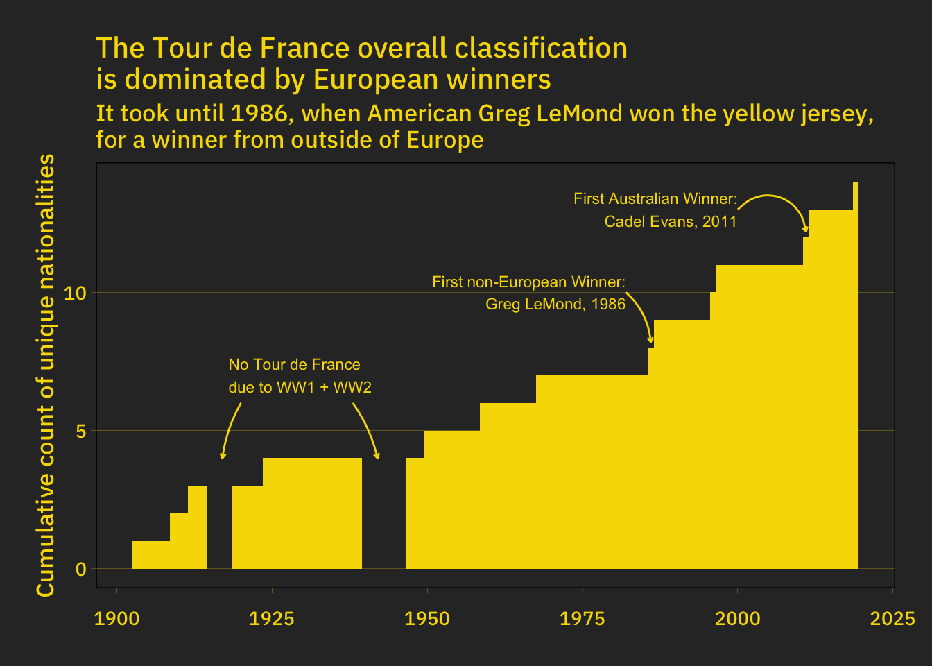
There is a steady increase for the overall winners, but how does the same plot look like just for the stage winners?
#plot cumulative count of stage winners nationalities
cum_nat_stages <- tdf_stages %>%
  mutate(start_year = year(Date)) %>%
  arrange(Date) %>%
  mutate(cum_unique_nationalities = cumsum(!duplicated(Winner_Country))) %>%
  group_by(start_year) %>%
  summarise(cum_unique_nationalities = max(cum_unique_nationalities)) %>%
  ggplot(aes(x=start_year, y = cum_unique_nationalities))+
  geom_bar(stat = "identity", fill=c_yellow, width = 1.)+
  annotate( geom = "curve", x = 1960, y = 32, xend = 1985, yend = 27,
  curvature = -0.25, arrow = arrow(length = unit(1, "mm")), color = c_yellow)+
  annotate(geom = "text", x = 1958, y = 32, label = "More international stage winners\nin the 80s and 90s",
           hjust = "right", size = 3, color = c_yellow)+
  theme_minimal()+
  theme(
    text = element_text(color = c_yellow, size = 13, family = "IBM Plex Sans Medium"),
    plot.background = element_rect(fill = c_black,
                                   color = c_black),
    panel.background = element_rect(fill = c_black),
    axis.ticks = element_line(color = c_yellow, size = 0.05),
    axis.text = element_text(color = c_yellow),
    axis.text.x = element_text(color = c_yellow, margin = margin(t = 10)),
    axis.title.x = element_text(margin = margin(t = 10), face="bold"),
    plot.margin = margin(20, 20, 20, 20),
    panel.grid = element_blank(),
    panel.border = element_blank(),
    panel.grid.major.y = element_line(color = c_yellow, size = 0.05)
  )+
  labs(title = "Tour de France stage winners are more diverse",
       subtitle = "Riders from more than 40 countries\nhave won a stage at the Tour de France",
       x = NULL,
       y = "Cumulative count of unique nationalities")

cum_nat_stages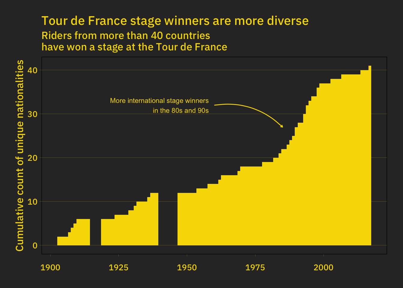
There are far more international stage winners than overall winners. For the stage winners there was a huge increase in the 80s and 90s but since then it flattened. It will be intersting if that trend will continue or if cycling and the Tour de France can attract cyclist from more diverse backgrounds.
/Lukas