TidyTuesday Week 14: Beer Production in the US
By Lukas Steger
I have to say as a homebrewer this week’s #tidytuesday got me quite excited. 🍺
This is the first time I use the {ggdark} package to convert regular ggplot2 themes into a dark version.
The data was mainly gathered from pdf report using {pdftools} and some {stringr} magic, therefore the data includes total rows and some missing and duplicate values.
Before working on the visualization I will spend some time on cleaning the dataset to then answer the question “How did the total beer production per year develop over the last 10 years by brewery size?”:
library(tidyverse)
library(ggdark)
# Get the Data
brewer_size <- readr::read_csv('https://raw.githubusercontent.com/rfordatascience/tidytuesday/master/data/2020/2020-03-31/brewer_size.csv')

beer_production_size <- brewer_size %>%
  #remove total columns
  filter(!str_detect(brewer_size, "^Total")) %>%
  #categorize breweries regarding to yearly output. Source:
  #https://www.brewersassociation.org/statistics-and-data/craft-beer-industry-market-segments/
  mutate(brewer_size = case_when(brewer_size %in% c("Zero Barrels",
                                                    "Under 1 Barrel",
                                                    "1 to 1,000 Barrels",
                                                    "1,001 to 7,500 Barrels",
                                                    "7,501 to 15,000 Barrels") ~ "Microbreweries",
                                 brewer_size %in% c("15,001 to 30,000 Barrels",
                                                    "30,001 to 60,000 Barrels",
                                                    "60,001 to 100,000 Barrels",
                                                    "100,001 to 500,000 Barrels",
                                                    "500,001 to 1,000,000 Barrels",
                                                    "1,000,001 to 1,999,999 Barrels",
                                                    "1,000,001 to 6,000,000 Barrels",
                                                    "1,000,000 to 6,000,000 Barrels",
                                                    "2,000,000 to 6,000,000 Barrels") ~ "Regional Breweries",
                                 brewer_size %in% c("6,000,001 Barrels and Over") ~ "Large Breweries")) %>%
  #summarise duplicates for 2019
group_by(year, brewer_size) %>%
  summarise(n_of_brewers = sum(n_of_brewers),
            total_barrels = sum(total_barrels, na.rm = T),
            taxable_removals = sum(taxable_removals),
            total_shipped = sum(total_shipped, na.rm = T)) %>%
  #build plot
  ggplot(aes(x=as.factor(year),
             y=total_barrels,
             group=fct_reorder(brewer_size, total_barrels, .desc = T),
             color=fct_reorder(brewer_size, total_barrels, .desc = T)))+
  geom_point(size=2)+
  geom_line(alpha = .5, size = 1.3)+
  scale_y_continuous(labels = scales::label_comma(), trans='log10')+
  scale_x_discrete()+
  scale_color_manual(breaks = c("Large Breweries", "Regional Breweries", "Microbreweries"),
  values = c("#FEFFE5", "#FFEE70", "#FFD500"))+
  labs(title = "Total beer production US breweries in gallons (2009-2019)",
       color = NULL,
       fill = NULL,
       y  = NULL,
       x = NULL)+
  dark_theme_gray(base_size = 12) +
  theme(plot.background = element_rect(fill = "grey10"),
        panel.background = element_blank(),
        panel.grid.major = element_line(color = "grey30", size = 0.2),
        panel.grid.minor = element_line(color = "grey30", size = 0.2),
        panel.grid.major.x = element_blank(),
        legend.background = element_blank(),
        axis.ticks = element_blank(),
        legend.key = element_blank(),
        legend.position = c(0.85, 0.52))

beer_production_size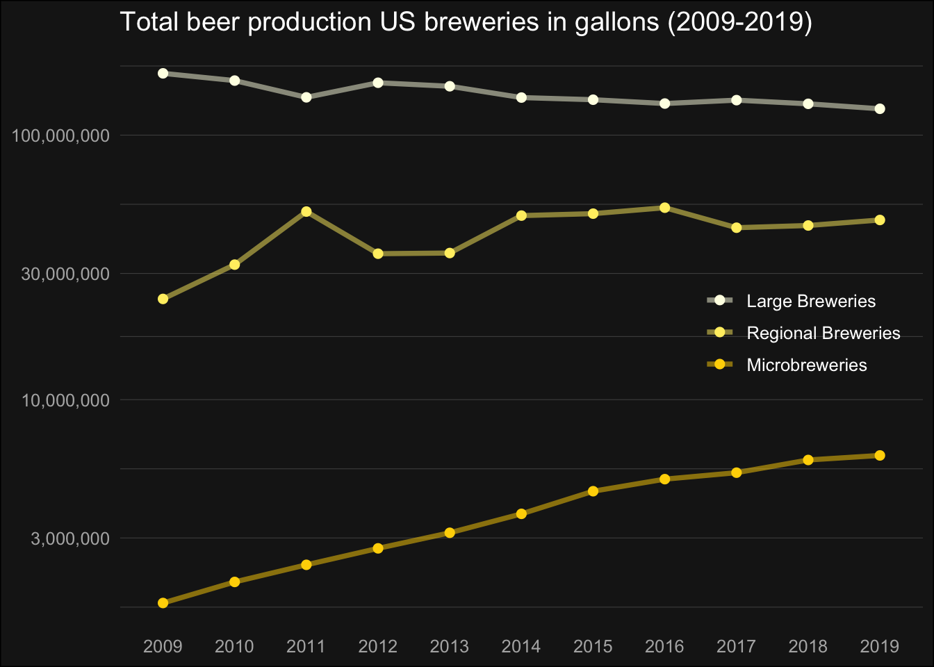
Note the log-transformed y axis, but it is clear to see that large breweries seem to have a hard time against the rising number of microbreweries and also the regional breweries seem to profit slightly from the trend towards craft beer!
Cheers,
Lukas